
Thursday, November 8, 2018
Monday, October 8, 2018

Tuesday, September 18, 2018
Wednesday, August 22, 2018
Assignment 2:
Part 1:
The concept
that struck me, after watching the video, the Gap, created by Ira Glass is that
having the “taste” is very important when we create a design. Creative work
starts from the taste. After watching the video, Milton Glaser, from Ted Talk,
I was inspired that we shouldn’t ever give up until we find a solution to our
question, or else we would never have a completed work that we are satisfied
with. Therefore, I learn that in order to have a good design, I should not give
up until I am satisfied with my design.
Part 2:
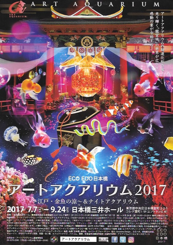
I saw this
poster while I was visiting Japan with my parents last year. I liked it because
the poster of this art aquarium was so attractive. It tried to tell you how the
exhibition would look like. I told my parents I would like to visit to find out
more. We waited for almost two hours to get into the aquarium. But when we were
inside the aquarium, I was a kind of disappointed because the exhibitions were
different from what I have imagined from the poster. However, I could not deny
that the poster has successful attracted me to purchase a ticket. Therefore,
the graphic designer of this poster is very successful and he is good.

This picture is
a book cover, designed by Karin Paprocki. This book was one of my favorite
series. The book cover was the reason why I brought this book at the beginning.
The cover was so attractive. The horse, Pegasus and the girl, Emily, were the
two main characters of the story. Karin used the white and red color for them,
which made it so sharpen. This is how I think the designer is successful.
Subscribe to:
Posts (Atom)